—————— BRIDGEPLUS
Creating a dynamic visual language for a new economy coworking space
—————— BRIDGEPLUS
Creating a dynamic visual language for a new economy coworking space
—————— BRIDGEPLUS
Creating a dynamic visual language for a new economy coworking space
—————— BRIDGEPLUS
Creating a dynamic visual language for a new economy coworking space
—————— BRIDGEPLUS
Creating a dynamic visual language for a new economy coworking space
————— DETAILS
The sharing economy is on the rise. Ride sharing, co-living and co-working have sparked competition globally. Bridgeplus, a thriving coworking space in SE Asia, needed to keep up. We helped spark a serious evolution of the brand by updating its visual identity and helping to position it as a space for serious startups and established companies.
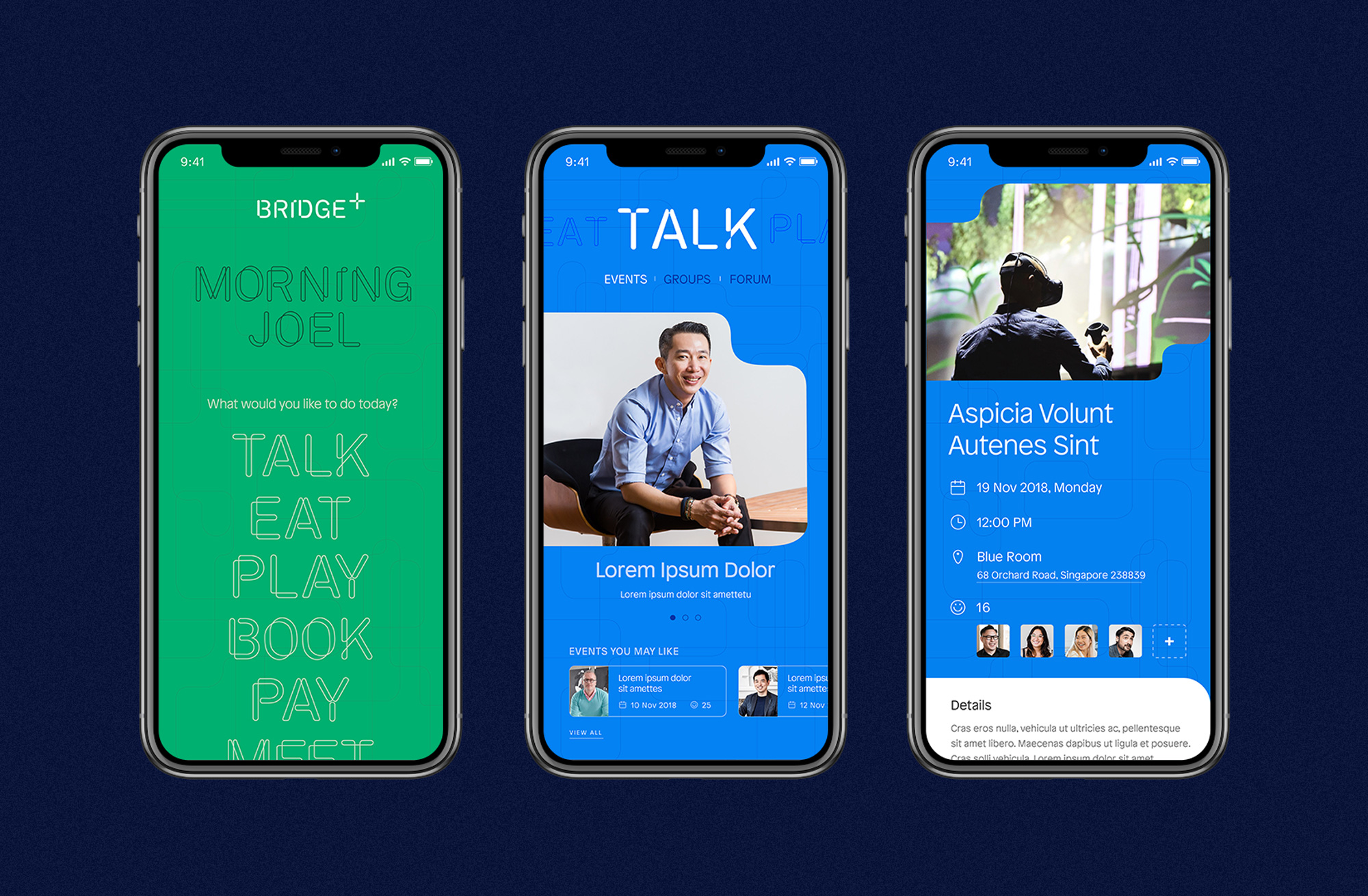
Our update helped Bridgeplus to codify its personality as a dynamic, unique and flexible space that welcomes the next generation of innovators doing work in a variety of sectors—from blockchain businesses to established brands.
The new Bridgeplus is a platform that helps people and businesses connect and thrive together.
————— DETAILS
The sharing economy is on the rise. Riding sharing, co-living and co-working have sparked competition globally. Bridgeplus, a thriving coworking space in SE Asia, needed to keep up. We helped spark a serious evolution of the brand by updating its visual identity and helping to position it as a space for serious startups and established companies.
Our update helped Bridgeplus to codify its personality as a dynamic, unique and flexible space that welcomes the next generation of innovators doing work in a variety of sectors—from blockchain businesses to established brands.
The new Bridgeplus is a platform that helps people and businesses connect and thrive together.
Agency: R/GA
Year: 2018
Role: Creative Director
Agency: R/GA
Year: 2018
Role: Creative Director
Agency: R/GA
Year: 2018
Role: Creative Director
Agency: R/GA
Year: 2018
Role: Creative Director
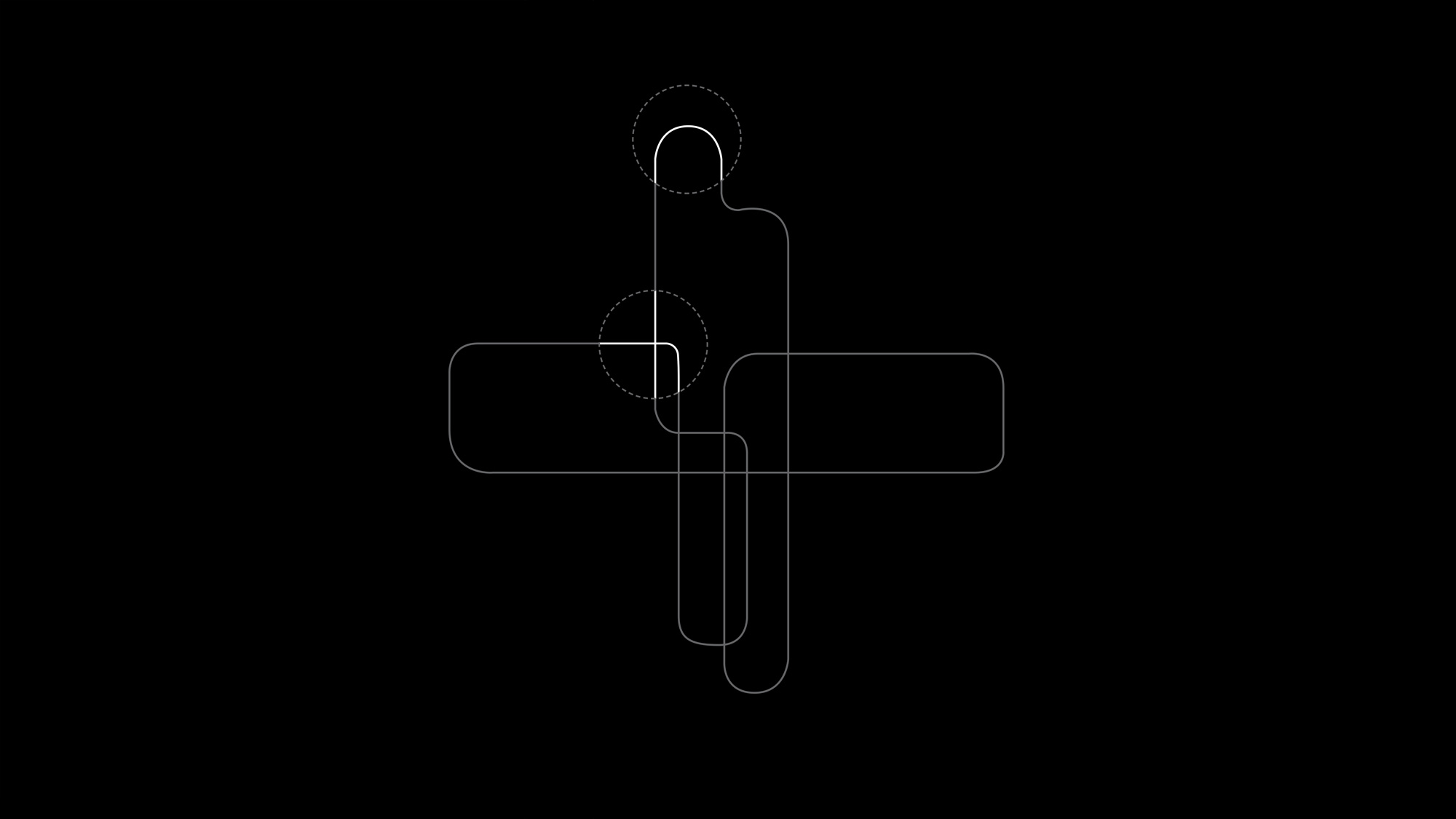
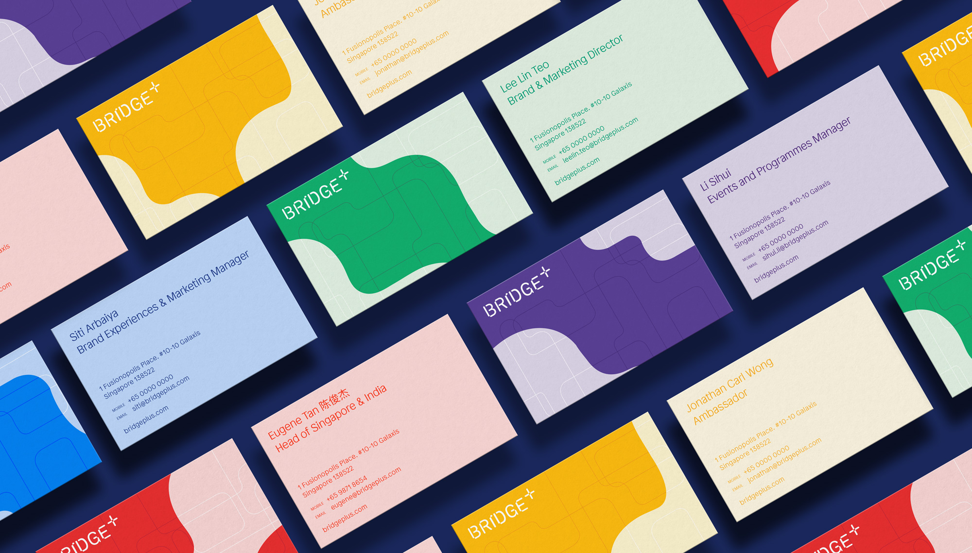
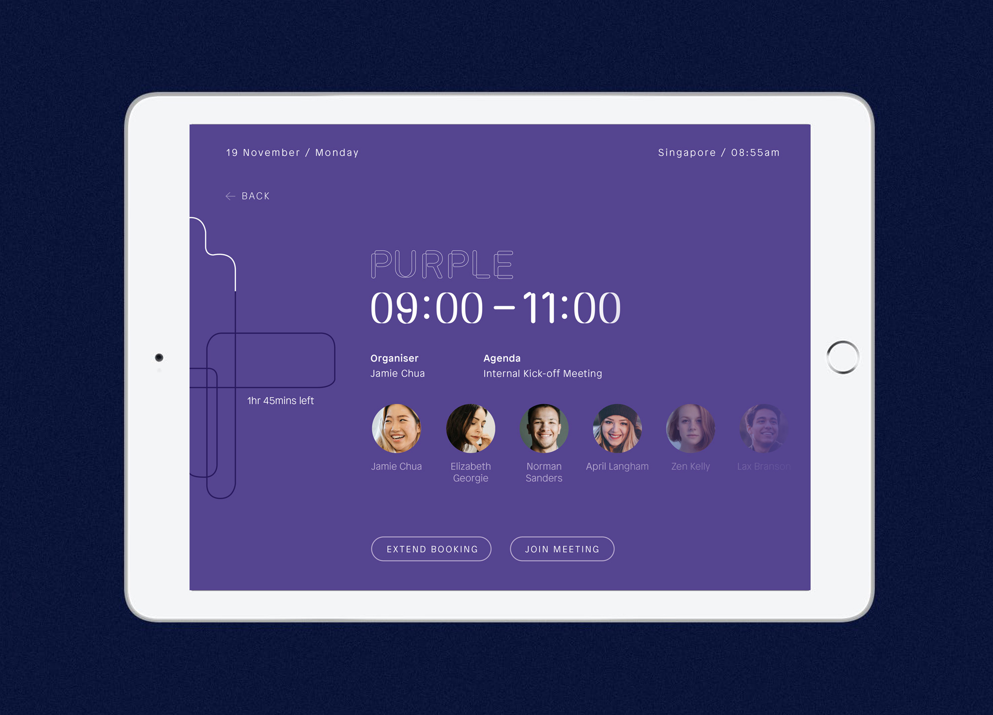
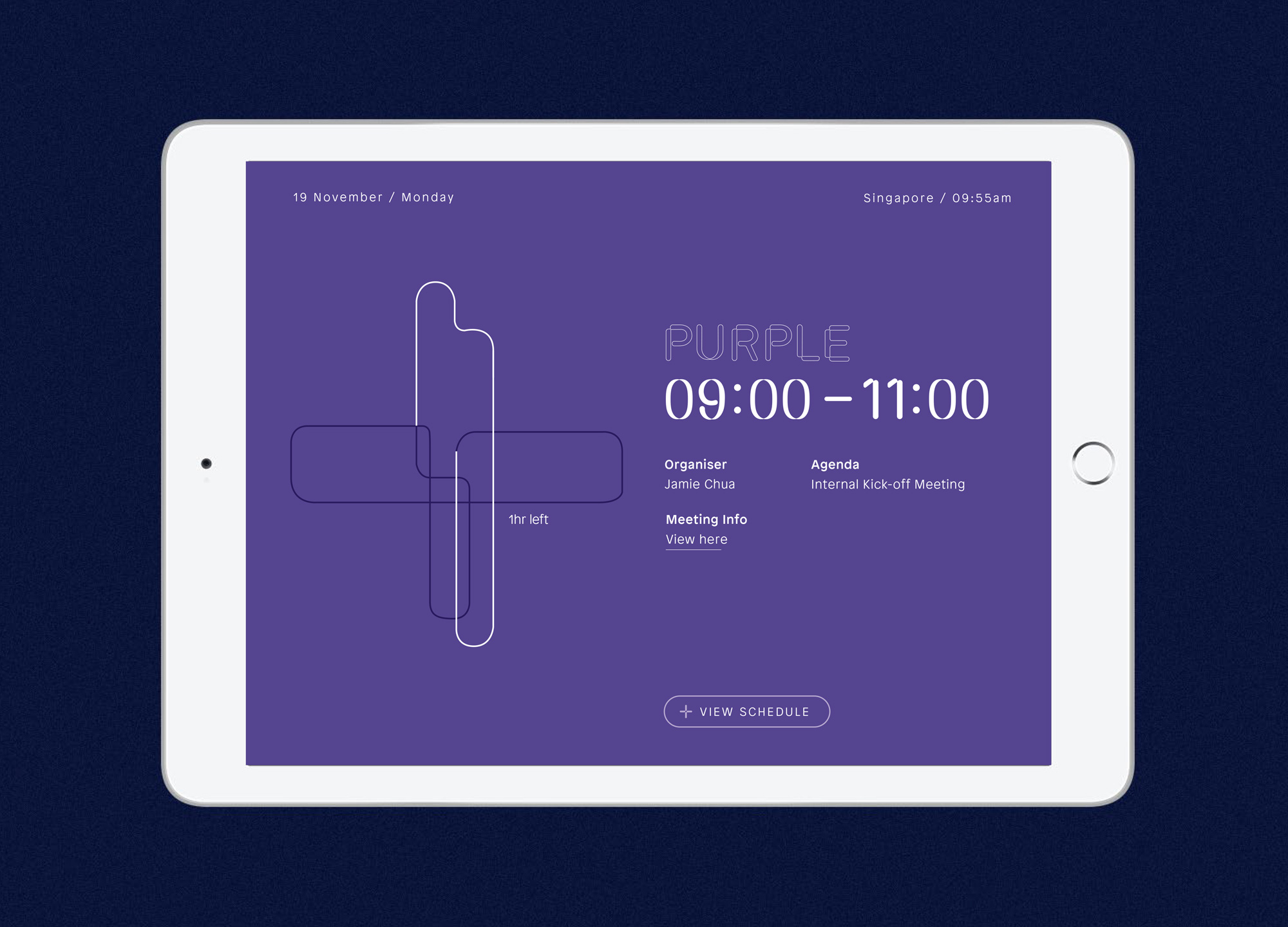
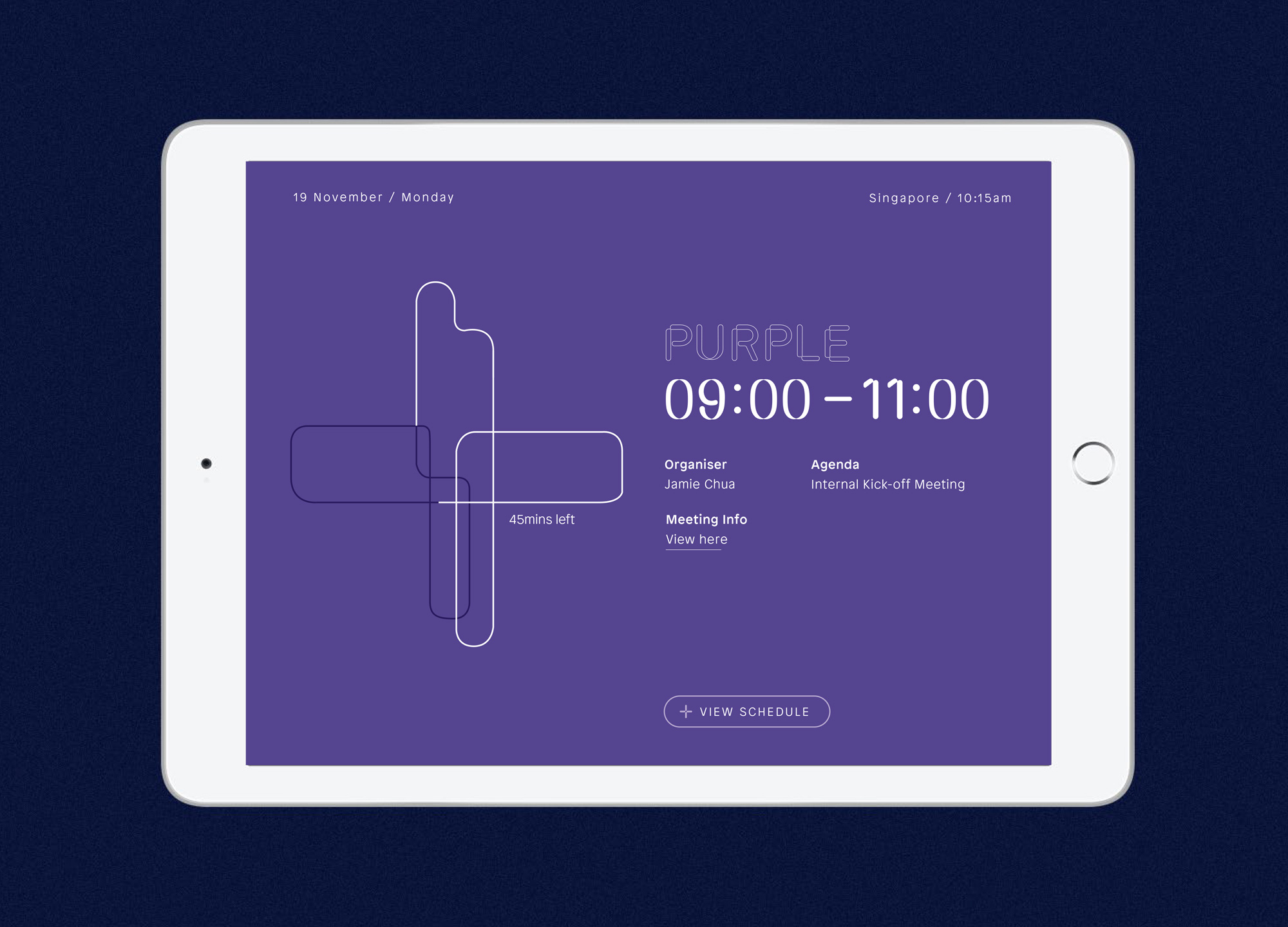
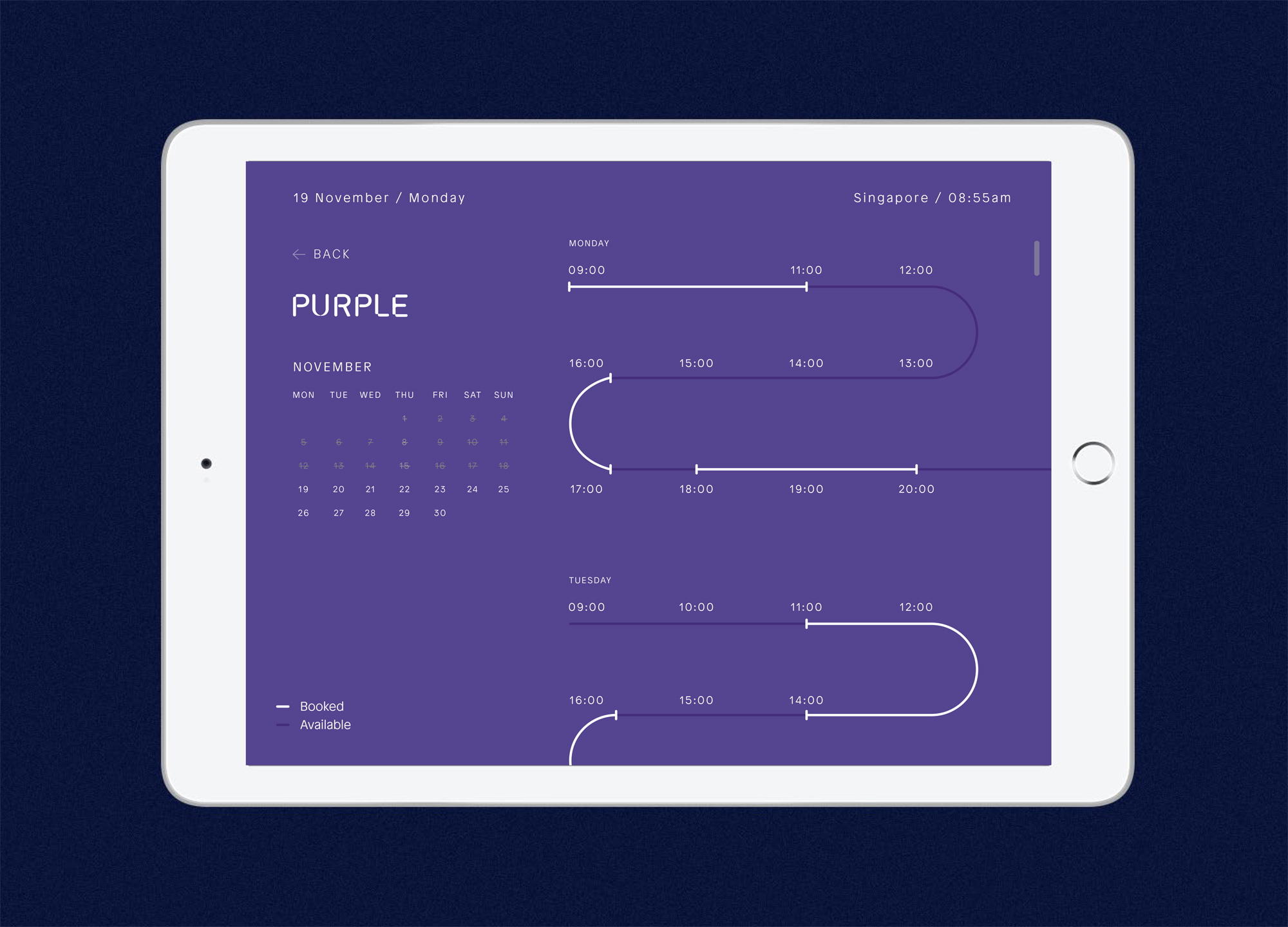
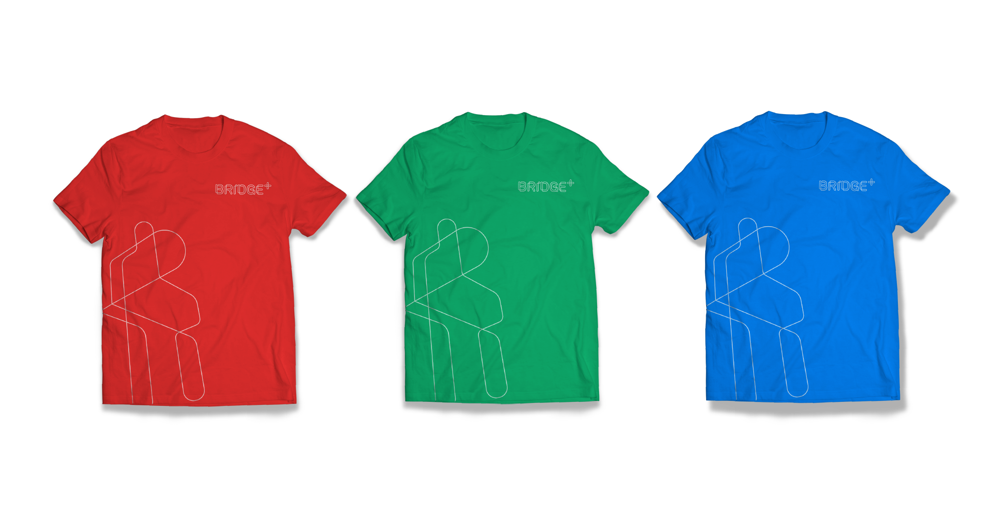
We developed a unique, architecturally-inspired visual mnemonic that can be flexibly used to represent Bridgeplus in its communications. The overlapping lines form distinctive negative spaces which reflect the unique work being done in each Bridgeplus space by its coworking tribes.
We developed a unique, architecturally-inspired visual mnemonic that can be flexibly used to represent Bridgeplus in its communications. The overlapping lines form distinctive negative spaces which reflect the unique work being done in each Bridgeplus space by its coworking tribes.
We developed a unique, architecturally-inspired visual mnemonic that can be flexibly used to represent Bridgeplus in its communications. The overlapping lines form distinctive negative spaces which reflect the unique work being done in each Bridgeplus space by its coworking tribes.
We developed a unique, architecturally-inspired visual mnemonic that can be flexibly used to represent Bridgeplus in its communications. The overlapping lines form distinctive negative spaces which reflect the unique work being done in each Bridgeplus space by its coworking tribes.
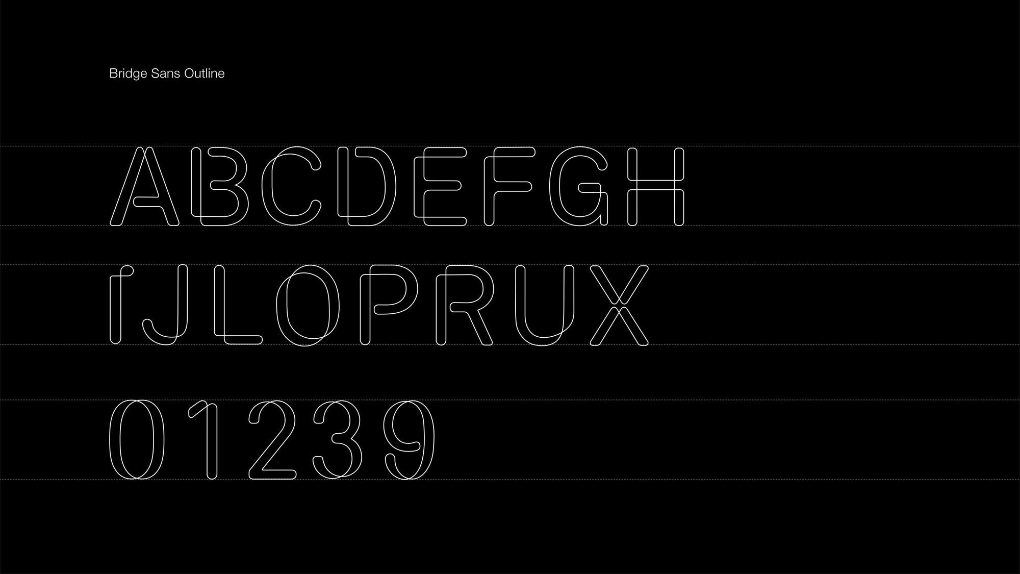
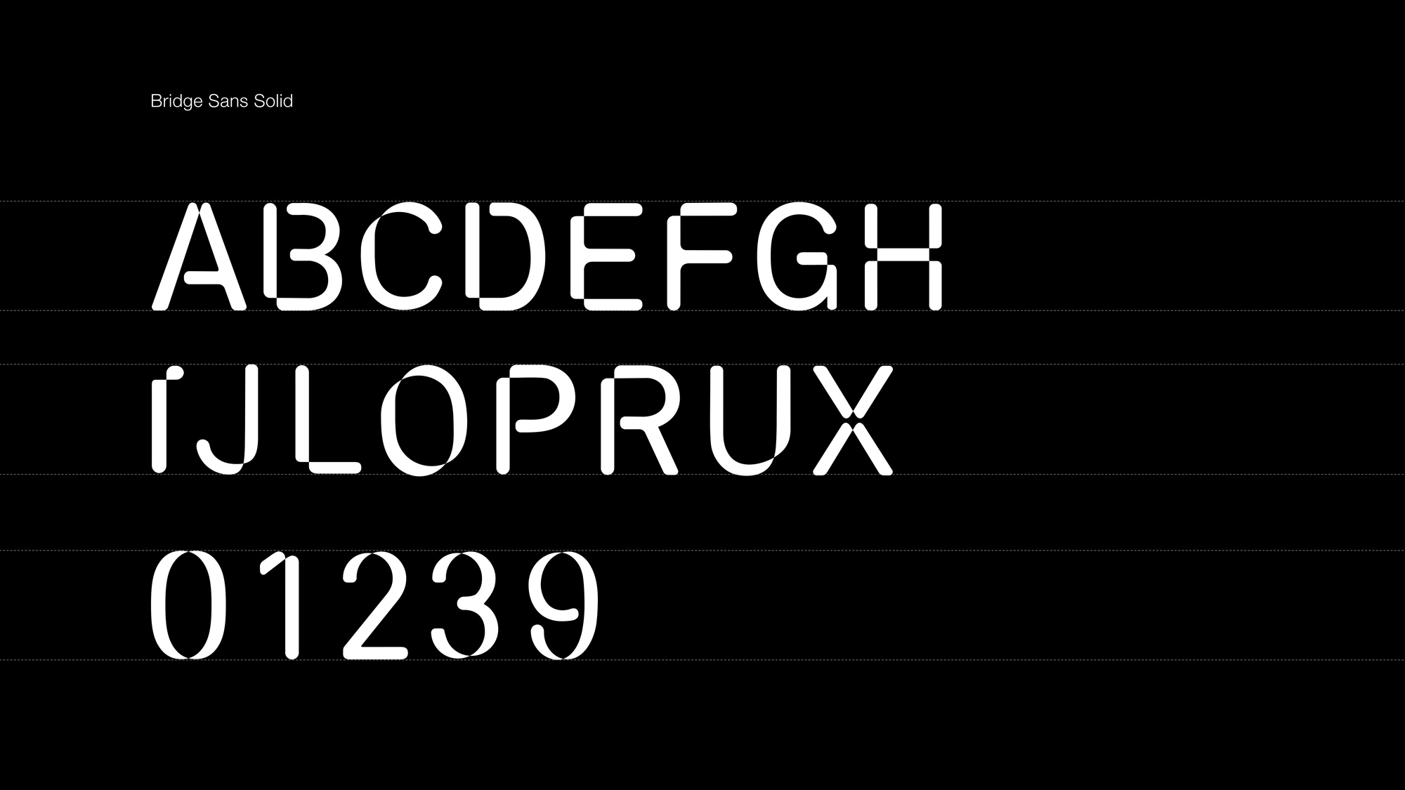
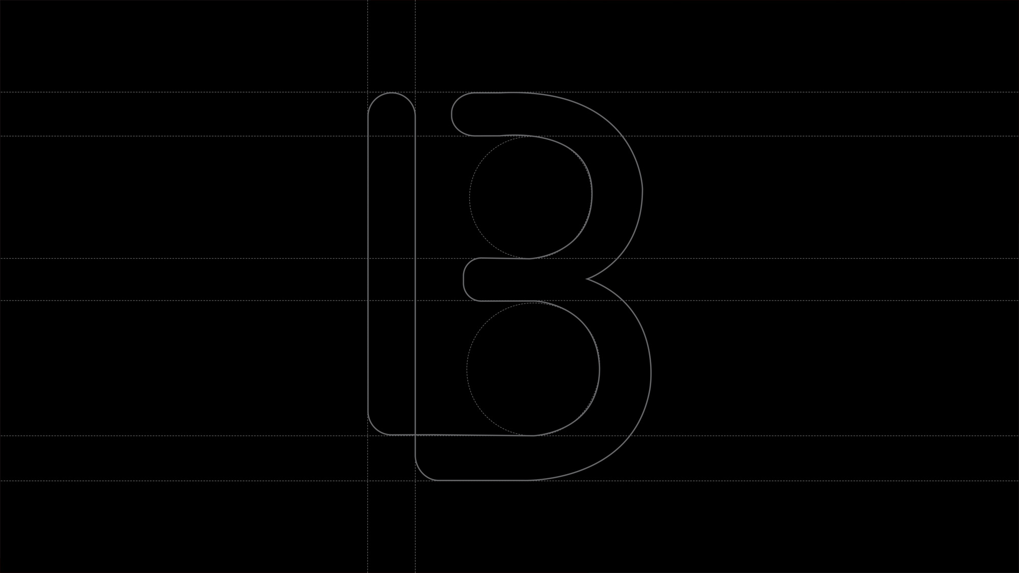
The plus shapes are designed with a rigid grid system to ensure consistency and harmony when used in various applications. The distinct curves serve as a key identifier for the Bridgeplus brand and helped to inspire a bespoke typeface for the brand in two weights: Bridge Sans Outline and Bridge Sans Solid.
The plus shapes are designed with a rigid grid system to ensure consistency and harmony when used in various applications. The distinct curves serve as a key identifier for the Bridgeplus brand and helped to inspire a bespoke typeface for the brand in two weights: Bridge Sans Outline and Bridge Sans Solid.
The plus shapes are designed with a rigid grid system to ensure consistency and harmony when used in various applications. The distinct curves serve as a key identifier for the Bridgeplus brand and helped to inspire a bespoke typeface for the brand in two weights: Bridge Sans Outline and Bridge Sans Solid.
The plus shapes are designed with a rigid grid system to ensure consistency and harmony when used in various applications. The distinct curves serve as a key identifier for the Bridgeplus brand and helped to inspire a bespoke typeface for the brand in two weights: Bridge Sans Outline and Bridge Sans Solid.

————— A LIVING VISUAL IDENTITY
————— A LIVING VISUAL IDENTITY
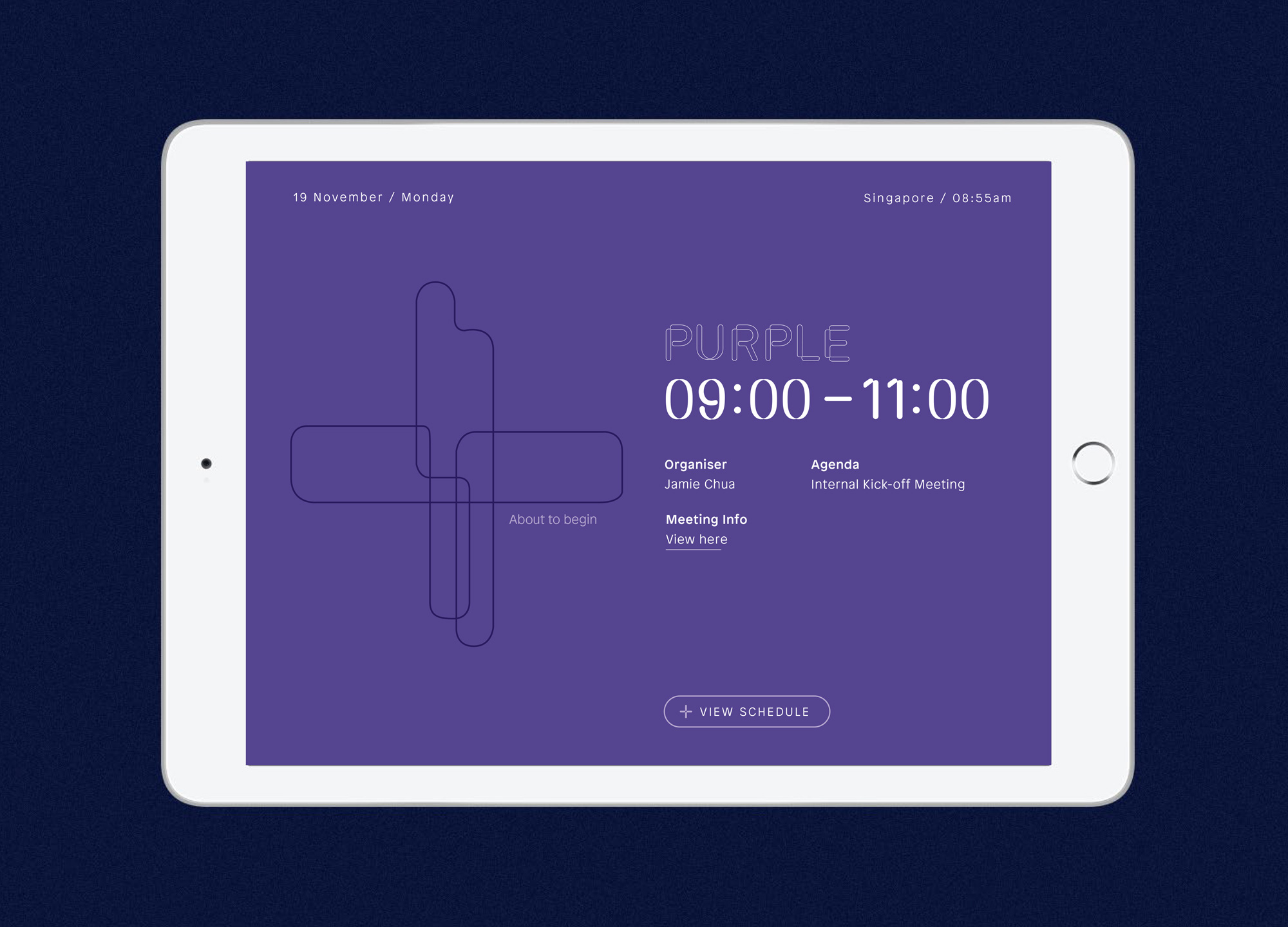
As part of our exploration for the Bridgeplus visual identity, we experimented with how the brand could live beyond two dimensions by extruding the interlocking lines and abstract shapes. This allowed us to stay true to the original architectural intent of the visual system, yet unlock new visual possibilities.
As part of our exploration for the Bridgeplus visual identity, we experimented with how the brand could live beyond two dimensions by extruding the interlocking lines and abstract shapes. This allowed us to stay true to the original architectural intent of the visual system, yet unlock new visual possibilities.
As part of our exploration for the Bridgeplus visual identity, we experimented with how the brand could live beyond two dimensions by extruding the interlocking lines and abstract shapes. This allowed us to stay true to the original architectural intent of the visual system, yet unlock new visual possibilities.
As part of our exploration for the Bridgeplus visual identity, we experimented with how the brand could live beyond two dimensions by extruding the interlocking lines and abstract shapes. This allowed us to stay true to the original architectural intent of the visual system, yet unlock new visual possibilities.
—————— STATUS
Let's have a chat. I love coffee and good conversation.